Subscription Experience Redesign
Redesigned Nespresso's subscription experience to improve clarity, flexibility, and conversion by simplifying the user journey, improving plan flexibility, and strengthening user incentives.
Overview
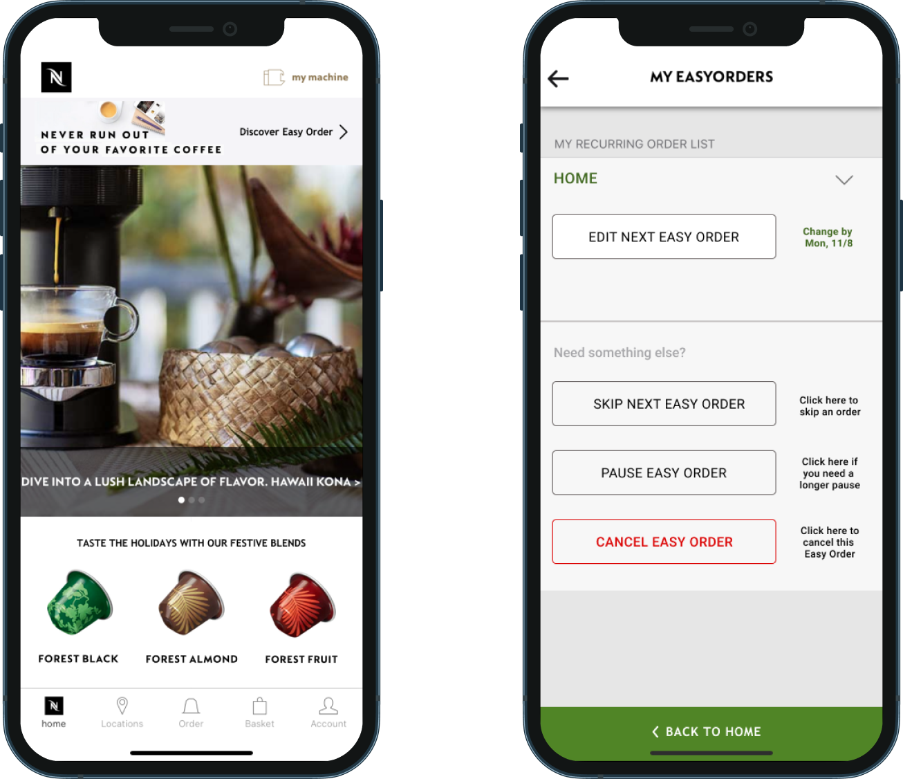
Nespresso's Easy Order auto-delivery feature wasn't growing as expected. The feature was buried in the app and hard to find, the value proposition was unclear, and the user experience left customers confused about how to manage their orders. From a business standpoint, Easy Order was critical: it was the mechanism for keeping customers in the Nespresso ecosystem long-term.
Goal: Redesign Easy Order to increase adoption and retention by improving discoverability, flexibility, and the clarity of its value to users.
Approach
- Conducted user interviews and competitive analysis. A key insight was that 50% of users order every 3–4 months, meaning flexibility in delivery frequency and strong incentivization were the primary conversion levers, not just UX polish
- Built a prioritization board to weigh effort vs. impact across feature improvements, keeping scope grounded in what could realistically ship within the existing design system
- Surfaced Easy Order earlier in the app and at point of purchase to increase visibility and drive sign-ups
- Clarified messaging around shipping, rewards, and free samples to make the value of subscribing concrete and compelling
- Validated designs through usability testing, using an affinity map to identify what worked and what needed refinement
Solution
Streamlined Subscription Flow
Simplified the setup and checkout experience to reduce friction and make enrollment more intuitive.
Improved Flexibility
Introduced delivery options aligned with real user behavior, allowing users to better control frequency and quantity.
Clearer Value & Incentives
Enhanced messaging around free shipping, rewards, and samples to better communicate the benefits of subscribing.
Increased Visibility
Integrated Easy Order more prominently across the app to improve discoverability and drive adoption.
Sample Pack Landing Page
Designed a sample pack landing page in collaboration with product and marketing teams to drive new SKU trials and product mixity. It served as a key differentiator for direct-to-consumer sales and gave new users a low-commitment entry point into the Nespresso ecosystem.
Impact
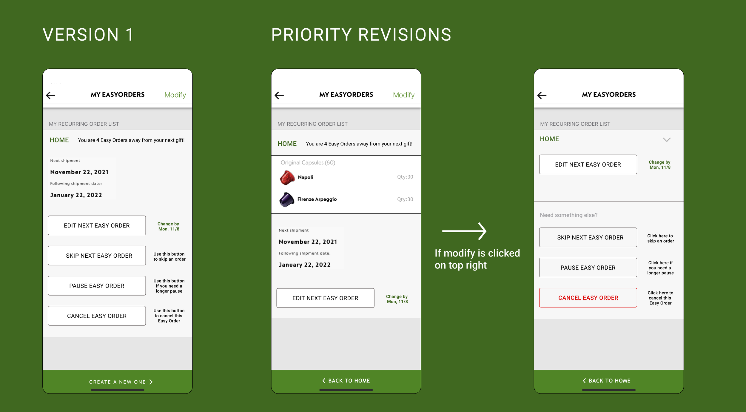
- Usability testing validated the revised plan management flow. Testers responded positively to the added detail around order scheduling, rewards countdown, and the clearer button hierarchy for editing, skipping, pausing, and canceling
- Iterative testing surfaced specific gaps (missing shipping details, ambiguous "Modify" label) that were addressed in Priority Revisions before handoff, demonstrating a tight design-test-refine loop within a compressed timeline
- Designs were shared directly with the Nespresso team managing the product and received positive feedback. The project ended at handoff, before post-launch data could be tracked
Reflection
Working directly with the Nespresso team grounded this project in real constraints. Understanding what was feasible within their existing design system shaped every prioritization decision. The experience reinforced that stakeholder conversations aren't just a step in the process; they're where the real scope and tradeoffs get defined. If I had more time, I would have tackled the end-to-end repeat order flow at checkout, and I'd have pushed to rethink the "Easy Order" branding itself. The naming was a source of confusion that no amount of UX polish could fully fix without addressing the language at its root.